schneeschmelze
Benutzer
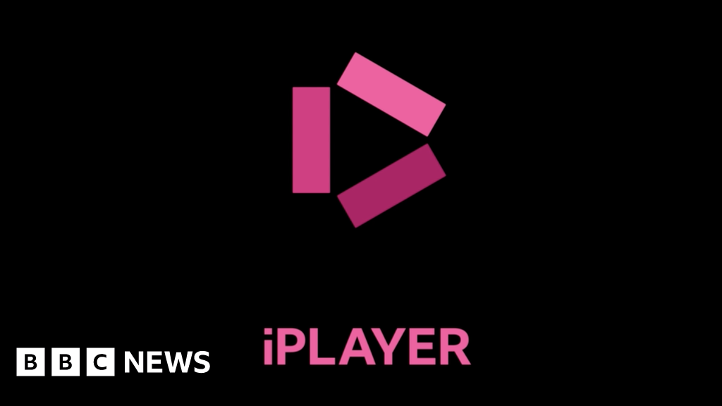
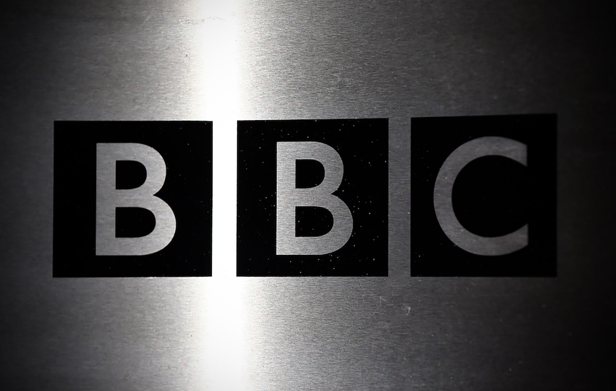
Die BBC modernisiert ihr Logo: Die drei Blocks rücken etwas auseinander, vor allem aber wird die klassische Schriftart Gill Sans durch die neue Hausschrift BBC Reith ersetzt. Dadurch sollen Lizenzkosten eingespart werden. Auch Icons für einzelne Dienste werden neu eingeführt bzw. angepasst. Die Einführung erfolgt schrittweise seit Februar 2021 (!) und soll bis zu den Feiern zum 100. Geburtstag im kommenden Jahr abgeschlossen sein.
 www.bbc.com
 www.nme.com
 en.wikipedia.org
BBC reveals new logos in modern makeover
The BBC logo is updated for the first time in 24 years as services like iPlayer also get a revamp.
www.bbc.com
BBC defends new logo despite minimal changes
The BBC has defended their new logo, which has received backlash online over its apparent minimal changes to the typeface
www.nme.com
Logo of the BBC - Wikipedia
Zuletzt bearbeitet:
")